

Cart & Checkout Discovery in E-Commerce
Packaging Industry | Sr. UX Researcher
Tools Used: Miro | Microsoft Teams | Qualtrics
Overview
The primary purpose of this study was to gain a deeper understanding of the specific areas where our users are experiencing friction during the purchasing process. By identifying these pain points, we aim to enhance the overall user experience and streamline the journey from selection to purchase.
Research Methods
UX Audit | An audit was conducted to identify UX flaws, inconsistencies, missed edge cases, confusing copy, and areas for further research.
Secondary Research | Best UX practices for e-commerce checkout experiences were examined and shared with the team.
User Interviews | Five user interviews were conducted to gather insights on the full cart and checkout process.
CX User Survey | A survey was distributed to gather feedback on the overall customer experience and identify areas for improvement.
UX Audit | Cart & Checkout Improvement Opportunities
For this research, I analyzed the cart and checkout experience and mapped each screen in Mural. Key areas for improvement were identified, and while I can only share high-level findings due to company privacy, I can provide more details upon request. Addressing these areas will improve the user experience, boosting satisfaction and conversion rates.
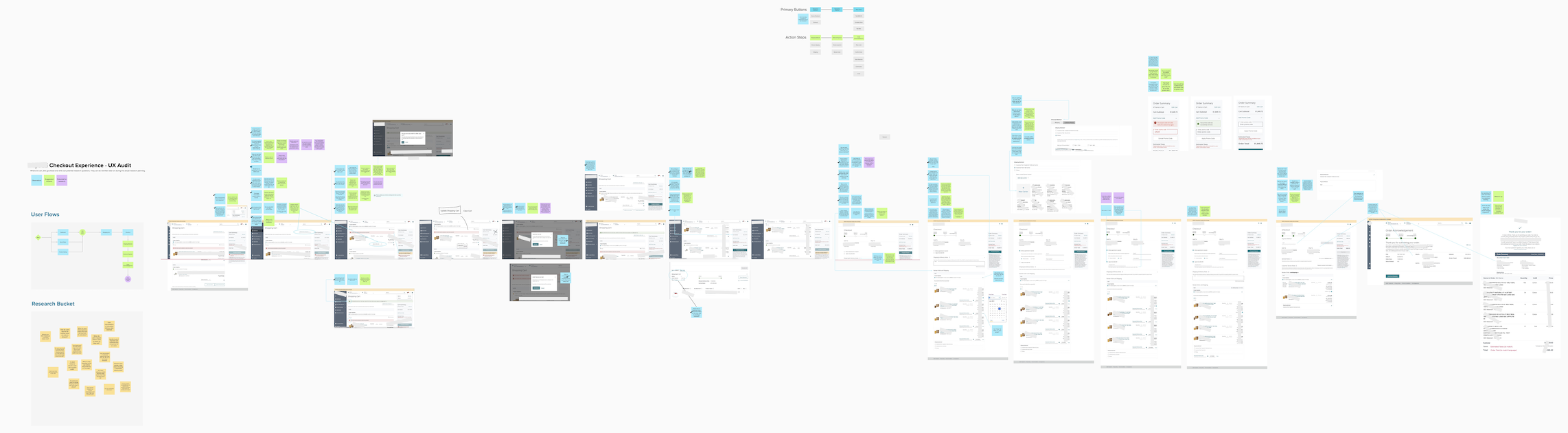
Scroll Depth vs. Information – Display more information above the fold to boost engagement and streamline the shopping experience.
Process Step Content Alignment – Ensure corresponding steps and inputs are visually closer to reduce cognitive load during the cart and checkout process.
Multiple CTA "Place Order" Buttons – Evaluate the necessity of multiple "Place Order" buttons to streamline the checkout process.
Freight Eligibility Clarity and Understanding – The freight eligibility information is unclear. Simplify the UI to clearly show the amount needed to qualify for free freight.
Payment Method Location – Keep the Payment Method section consistently positioned between Shipping Methods and Review & Payment to reduce user confusion.
Copy Inconsistencies & Repetition – Standardize terminology, such as "Shopping Cart" vs. "My Cart" and "Quantity" vs. "Qty," to reduce confusion.
UX Banner Notifications – Standardize the size, color, and messaging of UX banner notifications for a cohesive experience.
Date Picker UI – Reevaluate the date picker design to improve clarity and user experience.
Checkbox Component & Asterisks – Ensure checkboxes are used correctly and asterisks clearly indicate required vs. optional fields.
Modal Sizes and Font Selection – Standardize modal sizes and fonts for a cohesive design.
Cart and Order Summary UI – Standardize UI elements between Cart and Order Summaries, including font weight, spacing, and size.
Promo Code Functionality – Ensure consistency in promo code copy, alerts, and behaviors across pages.
Secondary Research | UX Best Practices for Cart & Checkout
CTA Buttons – Make CTA buttons visible and near related information, using contrasting colors and clear wording to improve visibility and clicks.
Copywriting – Use consistent terminology, such as “Credit Card Number” instead of “Card #.”
Required Fields – Clearly mark required fields without asterisks.
Field Validation & Errors – Validate fields and highlight errors consistently (e.g., red for empty required fields).
Pickup vs. Shipping – Highlight the benefits of “Pickup,” such as potential savings.
Simplify the Process – Allow customers to return and complete their order later.
Delivery & Shipping – Present delivery options clearly.
Cost Transparency – Display all costs, including hidden fees, to avoid cart abandonment.
Timeline Transparency – Inform users of expected delivery times.
Help & Support – Offer easy access to timely assistance (phone, live chat, etc.).
Promo Codes – Make it clear where to enter promo codes at checkout.
Minimalist Experience – Keep the layout clean and simple.
Useful Resources | How to Create the Perfect Checkout Experience in 9 Simple Steps / How To Improve Ecommerce Checkout: 14 Tips / Checkout UX: Designing the Experience Your Customers Deserve / Checkout UX Best Practices 2024 — Baymard Institute
User Interviews | Customer Demographics & Overall Feedback
Five customers from the protective packaging industry participated, representing both purchasing and management roles.
Although the onboarding process was smooth, customers felt forced to transition to the platform, leading to frustration.
Although most customers expressed that their experience onboarding to the e-commerce purchasing platform went smoothly and without major issues, several customers still felt that the transition from traditional offline ordering to using the platform felt somewhat forced and often led to frustration; this was particularly true since it required the customer to engage in repetitive work when placing their orders, which did not align well with their previous, simpler ordering methods.
“But most of my conversations have been with [customer service] and how cumbersome we feel the system is and the response was essentially, it is what it is, this is the direction that [the company is going in and we have no choice but to use this portal.” - Customer
“Well for me using a purchasing system here, I guess my upfront thoughts were that it’s redundancy but I’ve gotten used to it. I enter it out on my system, it allows me to print it out and just use it as a cheat sheet… I guess you know to enter into your system.” - Customer

User Interviews | Customer Purchasing Behavior
Most customers found adding items to their cart straightforward and easy to navigate.
ERP System Integration – 100% of customers copy material numbers from their ERP systems instead of searching by keywords. They suggested ERP integration to reduce repetitive tasks like importing purchase orders.
Prepaid Freight – 60% only complete purchases when they qualify for prepaid freight.
"There's very few times that we're going to purchase without prepaid freight." – Customer
Lead Times & Partial Shipments – 60% said estimated lead times impact their orders. They often contact customer service for partial shipments and expect estimated delivery dates to align with the highest lead time item.
Product Discovery – 60% prefer reaching out to sales reps or customer service for assistance rather than browsing the Product Catalog independently.
"Sometimes really finding product is the biggest problem..." – Customer
Delivery Appointments – 60% use the delivery appointment option and want the ability to save a default contact to avoid re-entering information.
Order Updates – 100% expect email notifications for delays, while 60% also expect updates from the shopping platform.
User Interviews | Cart & Checkout Confusion
Freight Eligibility – 60% found the interface unclear, struggling to determine the additional cost or materials needed for prepaid freight. Percentages used in the UI added to the confusion.
"Load Last" Option – 80% found this feature unclear; one customer believed it meant their product selection might be short or extra items might be added if space allowed. The current UI requires a selection instead of defaulting to one.
"Clear Cart" Visibility – 60% had difficulty locating this option.
User Interviews | Common Customer Service Touch-points
Order Adjustments – A customer may have ordered the wrong quantity of a material and requires help adjusting their order.
Delivery Date Requests – Customers may need help selecting a delivery date not available on the platform.
Product Availability – Customers may need to verify if a product is in stock before placing an order.
Prepaid Freight Issues – Customers with overfilled trucks may require customer service to manually select Prepaid Freight.
Product Availability – Customers may struggle to find products not available on the platform, often due to a lack of recent purchase history; specifically if they haven’t purchased the product in the last 12 months.
New Delivery Address – Customers may request the addition of a new delivery address for their end customer.
Many users frequently rely on offline assistance, as evidenced by their regular use of the platform's note feature.
At the time of this study, the platform offered three note fields for customers to provide additional information during checkout: Shipping & Delivery Notes, Customer Service Notes, and General Notes. While these allowed for clarifications, they increased the customer service workload as each note had to be reviewed after the purchase. Stakeholders wanted insight into which note fields were most used and important.
80% of customers use the Shipping & Delivery Notes.
60% use the Customer Service Notes.
0% use the General Notes, leading to its removal after the study.
CX Usability Survey Insights | 21 Total Responses
When evaluating user experiences with MySEE compared to other purchasing platforms, the feedback indicates a varied perception of usability.
43% of customers found the purchasing platform to function similarly to other e-commerce platforms, suggesting a level of comfort for many.
38% of customers reported that they found the purchasing platform more difficult to navigate, indicating room for experience improvements.
19% of customers reported that they found the purchasing platform much easier to use.
Recommendations for Improving the Cart & Checkout Experience
Multi Add to Cart Functionality | Allow customers to copy and paste multiple material numbers when adding items to their cart.
ERP Integrations | Integrate with popular ERP systems to reduce workload duplication.
Provide clarity on why products may not appear if they haven't been ordered in the past 12 months; this message should be displayed during searches.
Delivery Appointment - Default Contact | Let customers save a default contact for delivery appointments during checkout.
Improved Communication regarding Est. Lead Times | Improve communication both within the platform and offline regarding estimated lead times. By doing so, we increase customer trust in our product and reduce confusion and frustration when customers speak with customer service.
Improved Communication regarding Delayed Shipments | Enhance communication about delayed shipments and their reasoning, including adding notifications to the platform.
Simplify the Freight Eligibility UX | Simplify the freight eligibility interface to provide clarity on what it takes to qualify for prepaid freight.
Increase size of the “Clear Cart” | Increase the size of the "Clear Cart" button and position it according to user experience standards.
General Notes | Remove the General Notes option.
Simplify Load Last | Consider defaulting one material in the customer’s cart as the “Load Last” selection vs. forcing the user to choose one. Instead, we can state in a top level banner that the user can select another material if they’d like to update.
Improve Customer Assistance Lead Time | Ensure customers receive timely assistance, especially since some may feel forced to use the platform.