Validating Usability for a New Document Library
Packaging Industry | Sr. UX Researcher
Tools Used: Miro | Microsoft Forms | FullStory | Microsoft Teams | Usertesting.com - SUS
Overview
We developed a new Document Library on our B2B eCommerce purchasing platform, closely mirroring the one in our legacy product while integrating new features. To ensure an intuitive and consistent user experience, I conducted multiple usability research rounds, gathering insights to optimize UI/UX design, improve functionality, and enhance customer engagement. These findings provided actionable recommendations to boost usability, increase feature adoption, and reduce offline customer support interactions.
Research Methods
Design QA | Ensured the Document Library met design specifications and functioned as intended before broader testing.
Internal Feedback Survey | Collected insights from internal stakeholders to identify potential usability concerns early.
Data Analysis (FullStory) | Provided quantitative insights into user behavior, pain points, and interaction patterns.
Moderated Usability Interviews + SUS | Conducted in-depth qualitative interviews with users, complemented by the System Usability Scale (SUS) for standardized scoring.
Unmoderated Customer Service Usability Interviews + SUS | Gathered usability insights from the internal customer service team, paired with SUS for benchmarking.
Team Hypotheses
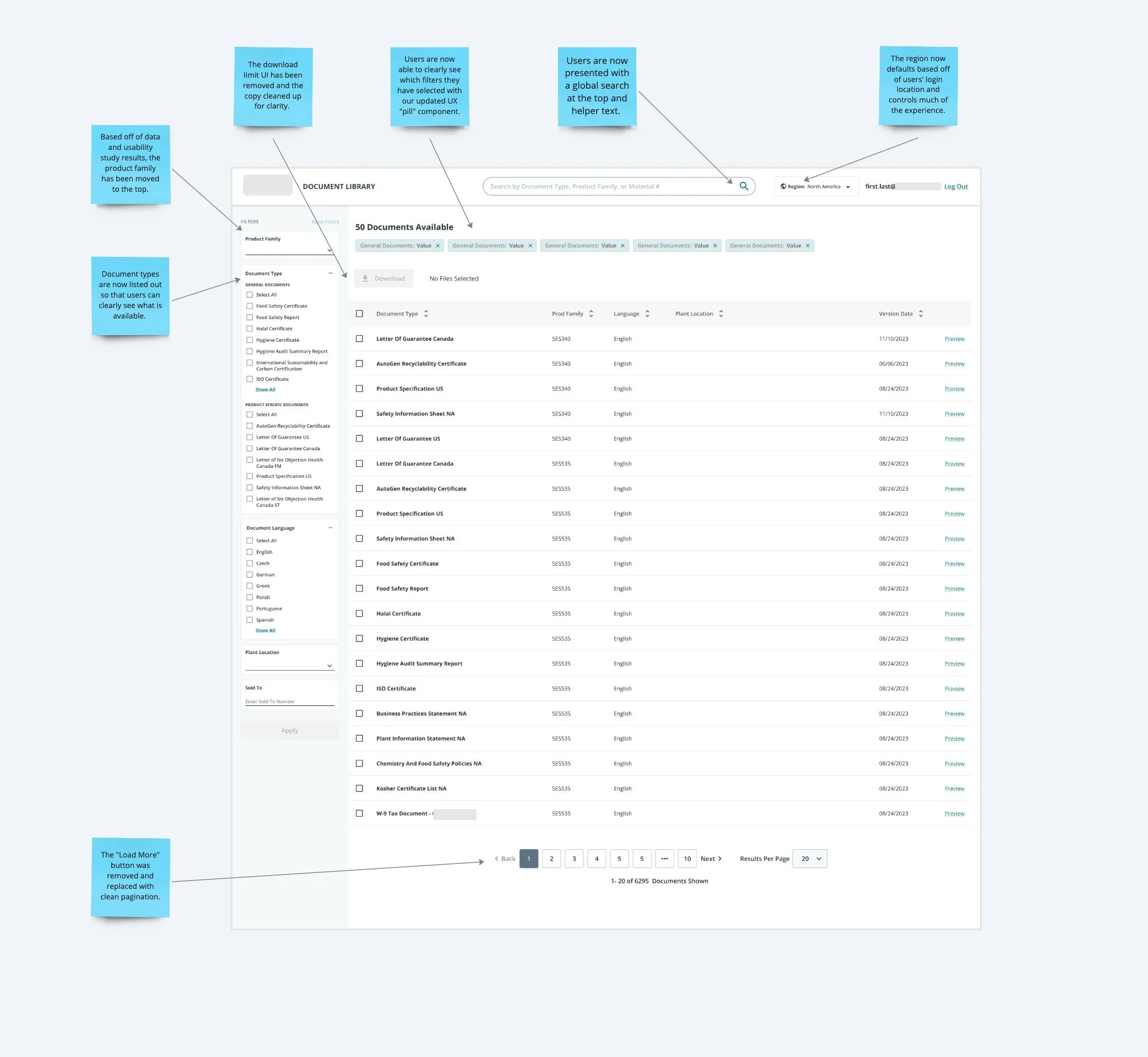
Region Update Placement | Customers may expect the region to be updated higher on the screen and default based on their location.
Clarification of Document Types | Customers may be confused by the difference between general and product-specific document types.
Document Type List for Usability | A list of document types, like in our legacy platform, may be more helpful than the current default.
Document Search Behavior | Document searches are likely tied to specific needs, such as an audit.
Reference to Previously Viewed Documents | Users could benefit from referencing previously viewed or downloaded documents.
Language Control Expectations | Since language is the 3rd most clicked, users may expect it to control the entire page, not just the documents.
Plant Location Confusion | The display of plant location information may confuse users, especially when showing all locations regardless of the region selected. The plant location may also not be as relevant to users as we think.
Design QA
In addition to ensuring that development recreated an experience based off of our Figma designs, I also took time to document anything that felt clunky in the experience.
I no longer have access to the Miro account, but a thorough review of the experience was conducted.
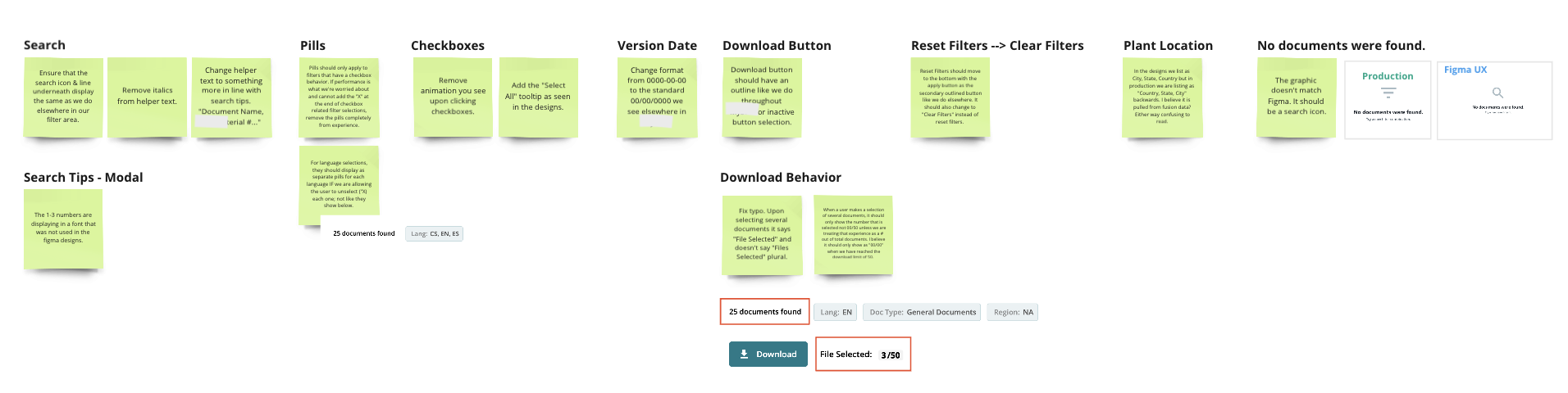
The Filters
Search Tips (Modal): Update font to match Figma design.
Search: Ensure visual consistency with other UI elements, including line extension, icon color, regular text, and helper text with suggestions.
Reset Filters: Move to the bottom, side by side with the Apply button, and change label to "Clear Filters."
Plant Location (Dropdown): Update format to "City, State, Country" as per the design.
The Table Header
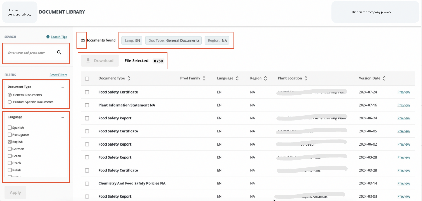
Pills | The pills should allow users to "X" out of each filter based on best practices, but currently, this functionality is not displayed as it should.
Download (Button) | Update our download button to match the inactive state for download buttons we use elsewhere in the platform.
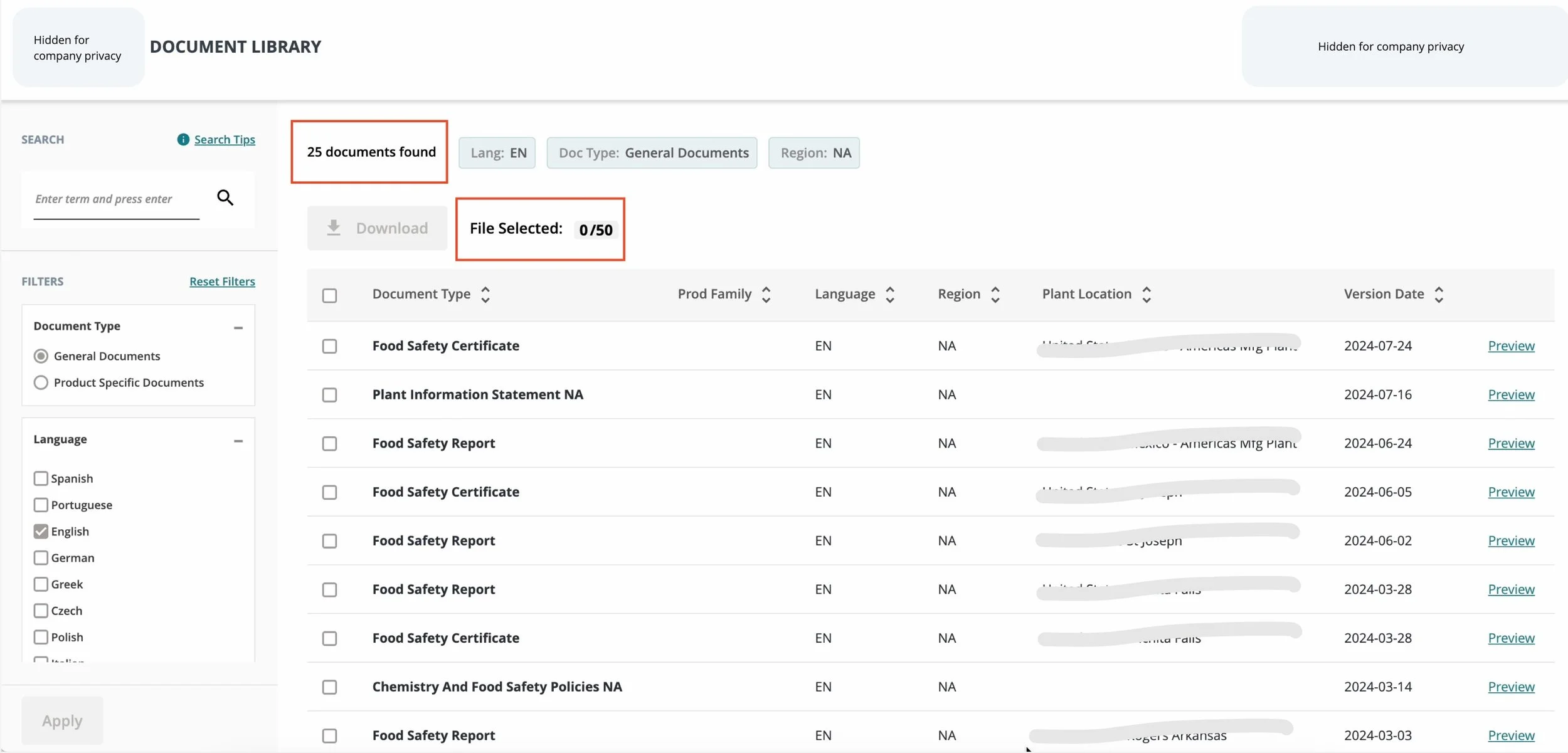
Download (Copy upon selecting documents) | Currently we are not using “Files Selected” plural when a customer selects more than one and displaying “File Selected” regardless.
Download Limit (Copy & UX) | We currently show 00/50 regardless of whether the customer selects 50 or more which is technically the download limit. I recommend that we only show a number out of 50 if the user selects 50 or more. It currently reads as 50 being a total number of documents and I anticipate this confusing customers.
The Table Content
Checkbox
Remove the animation that development added to the checkbox behavior.
Add the “Select All” tooltip as noted in the Figma files.
Version Date (Column) | Update format from 0000-00-00 to 00/00/0000 like we use in the platform.
Plant Location (Column) | Update format to City, State, Country like designs & platform.
No Documents Found (Graphic) | Update graphic to search icon as seen in Figma designs.
Internal Feedback Survey Insights | 16 Responses
For this portion of the research, I gathered initial usability feedback from both the Digital and Customer Service teams regarding the new Document Library, as many internal users will interact with it. The survey participants were asked to log in and explore the library before providing their feedback.
The feedback came from a total of 16 employees across the Digital Team and Customer Service teams, including:
7 employees from North America (NAM)
9 employees from Europe, the Middle East, and Africa (EMEA)
"The library looks fairly straightforward and clear to navigate." - Internal Survey
"I found it simple and relatively easy to navigate." - Internal Survey
"Not very pleasing to the eye in general. Looks very internally focused and not customer friendly.” - Internal Survey
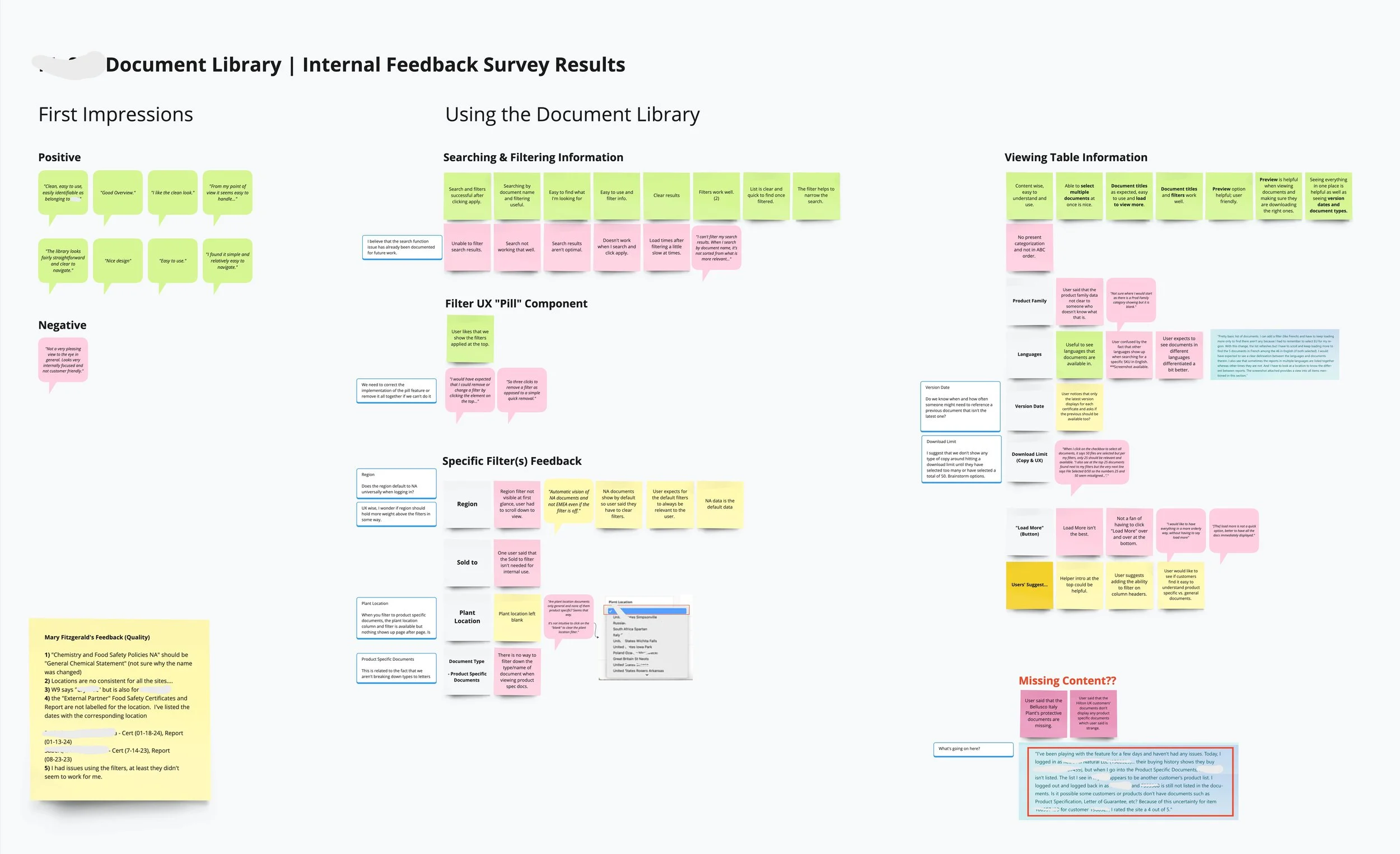
Internal Feedback Survey | Identified User Pain Points
Search Feature | The search function often failed to find expected documents, showing "No Results Found" even when relevant documents were available.
Filter Functionality | Filters didn’t integrate well with the initial search, resulting in poor usability. The "(UX pill component)" lacked the ability to remove individual pills, which contradicted UX best practices.
Region Default Setting | Customers were confused by the default region being set to NAM, despite their actual location. Additionally, the region filter was placed too low on the page, making it difficult to find and update.
Plant Location Filter | The "Plant Location" filter, which was only relevant for "General Documents," also appeared for "Product Specific Documents," causing unnecessary confusion.
Language Filter | The language filter malfunctioned, resulting in documents being displayed in languages not selected by the user.
Download Limit Display | Users misunderstood the "0/50" download limit display, assuming it meant they had 50 documents available, when it actually indicated the maximum they could download at one time.
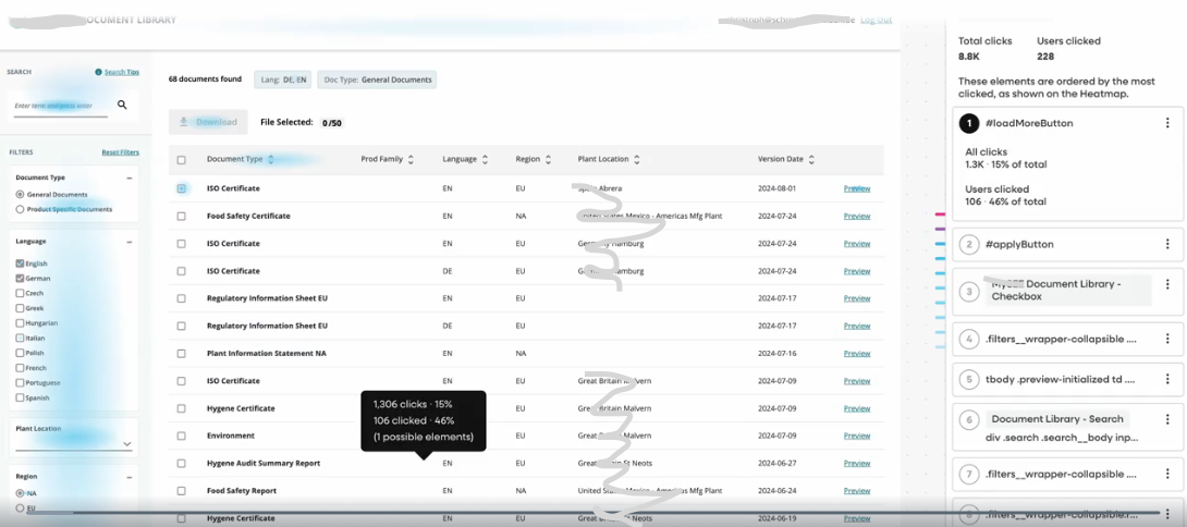
"Load More" Button | Users disliked the "Load More" button at the bottom of the table, finding it inefficient and disruptive to the user flow.
Data Analysis (FullStory) | 30 Days
User Demographics | Most of our users interacting with the system were based in North America.
Top Error Click | The checkbox component had the highest error click rate, with 89% of users encountering issues, likely due to its size.
Top Click | The "Load More" button was the most clicked element, with nearly 50% of users interacting with it. Other notable clicks included the Apply button, language filter, checkbox, and preview option.
Top Dead Click | The download button had the highest rate of dead clicks at 32% of users, followed by the download icon within the button, filter container, checkbox, and header area.
Search Behavior | The majority of users searched by product family, material number, product keyword, or document type (e.g., “ISO” or “SDS”).
Access Points | Most users accessed the Document Library directly from the dashboard, followed by clicks from the Product Detail Page (PDP) or Order Details.
Usability Interviews + SUS | Insights
This portion of the research focused on assessing the overall usability of the MySEE Document Library for both customers and internal customer service teams, with an emphasis on the Food segment across the NAM and EMEA regions. The research methodology included two main components:
Moderated Usability Interviews | Eight customer interviews were conducted via Teams, allowing for in-depth, real-time feedback.
Unmoderated Customer Service Interviews | Eight unmoderated interviews were conducted with customer service representatives using usertesting.com, providing insights into the internal user experience.
Both customers and customer service partners were generally impressed with the new UI and appreciated the ability to quickly access necessary documents in one centralized location.
“If I knew this was available to me instead of reaching out to you...then yeah, I would come here and get the document(s)... It’s kind of a one-stop shop, so it’s a good thing!” – Food Packaging Customer
“It’s much easier to operate than it used to be.” – Food Packaging Customer
Usability Interviews | Region Filter Find-ability
Note that the region should ideally dictate much of the user experience, however it did not for our first implementation.
The majority of customers interviews; 63%, could not find the region filter when asked to show me where they’d go to update their region and were confused by the fact that our table content often times displayed both regions regardless of their selection.
I was pleasantly surprised to see that 100% of customer service partners interviewed were able to successfully locate the region. However, 25% did say they’d prefer to update the region at the top of the page instead.
It was interesting to see that 75% of customers sorted the region column in the table when asked to update their region instead of finding the filter.
Usability Interviews | Document Types Customer Understanding
Although customers seemed to understand the difference in our document types, it wasn’t always clear to the user which document type (general vs. product specific) to select in the filters before searching. This realization supports the break down of document types.
“If I was looking for your SQF or the food safety report, that's what I would look for ...vs. a general document...So yeah, I mean environment... I don't know what that means.” - Food Packaging Customer
Customers described General Documents as viewing “everything”, “all documents”, “Basic documents”, and those related to audits.
Customers described Product Specific Documents as viewing documents related to the products they order including product spec sheets.
Customer Service described General Documents & Product Specific Documents as viewing documents related to customer audits & those they’ve seen in our legacy e-commerce platform.
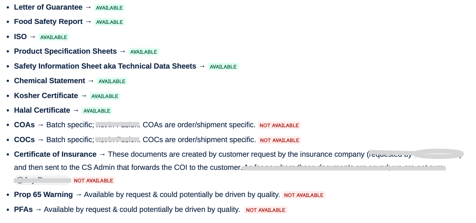
Usability Interviews | Customer Expectations Regarding Document Availability
Below is a list of documents customers mentioned during interviews that they would expect to see in the MySEE Document Library. I've tagged the document types we currently show versus those we don’t.
Usability Interviews | Customer Search Trends
Search Input Trends
It was interesting to see that the majority of customers, 63%, searched by "Product Family" to find the documents they needed. The remainder searched using either a material number or document keywords like "safety" or "letter of guarantee." Similarly, customer service teams also searched by Product Family and/or keywords. For clarity, a "Product Family" at this company refers to a combination of letters and numbers tied to specific brands or product groups.
These findings aligned with insights from the FullStory analysis, where I observed similar search trends across both customer and internal user behavior.
Frequency of Document Searches and Why
63% of customers reported searching for documents primarily for audit purposes.
The majority of customers said they are accessing documents several times a year to yearly. The remainder searched for documents related to customer inquiries, internal sales requests for product information, and for competitor comparisons.
Customer service partners access documents for audit purposes as well upon customer request.
Daily to several times a week, depending on their customer base and whether their customers are on our e-commerce platform.
Improving Document Accessibility and Retrieval
Both customers and customer service said it could be helpful to have a way of quickly accessing previously searched for or downloaded documents. However, customers (50%) had more thoughts around the concept.
“Have a favorites folder...” - Food Packaging Customer
“A history of searches or something?” - Food Packaging Customer
“It wouldn’t have to be such a broad search...this is what you looked for last year and the year before and the year before; it’d be kind of nice.” - Food Packaging Customer
Usability Interviews | Download Experience
100% of both customers and customer service interviewed felt like the download experience was clean and easy to understand and were able to easily find and preview documents.
Customers did mention the need for greater visibility regarding document expiration dates.
Yes, in fact 50% of customers found the current download limit UI confusing and associated 0/50 with the total number of documents shown instead of the total number they can download at once. I didn’t receive feedback on the download limit UI since the CS interviews were unmoderated but expect that i would have if moderated.
“So be nice to know if it's good for a year, expires here or doesn't expire and then don't have a date on them at all.”
Usability Interviews | “Load More” Feature Feedback
Both customers (63%) and customer service (43%) suggested adding pagination to the experience. The remainder were okay with the current experience.
Usability Interviews | Language Filter Feedback
It was encouraging to hear that the majority; 75% of customers and 71% of customer service expected for the language filter to display documents in their selected language(s). customers; The remainder expected for both the library & the documents to translate to the language they selected.
As far as usage, 85% of customers and 71% of customer service said no, they wouldn’t use this filter often. This was interesting since we anticipated this filter being more highly valuable to customer service partners.
Usability Interviews | Plant Location Relevance to User
For customers, they said it’s not useful to have the plant location content listed or available to filter down from since they don’t typically know where their products are being produced. It’s not surprising then that 87% of customers said they wouldn’t use this filter.
However for customer service, 71% said yes the plant location filter is both useful and important when narrowing down a document search. Likewise, 71% said they would use this filter often. This data points to a need for better defined internal vs. external customer facing experiences.
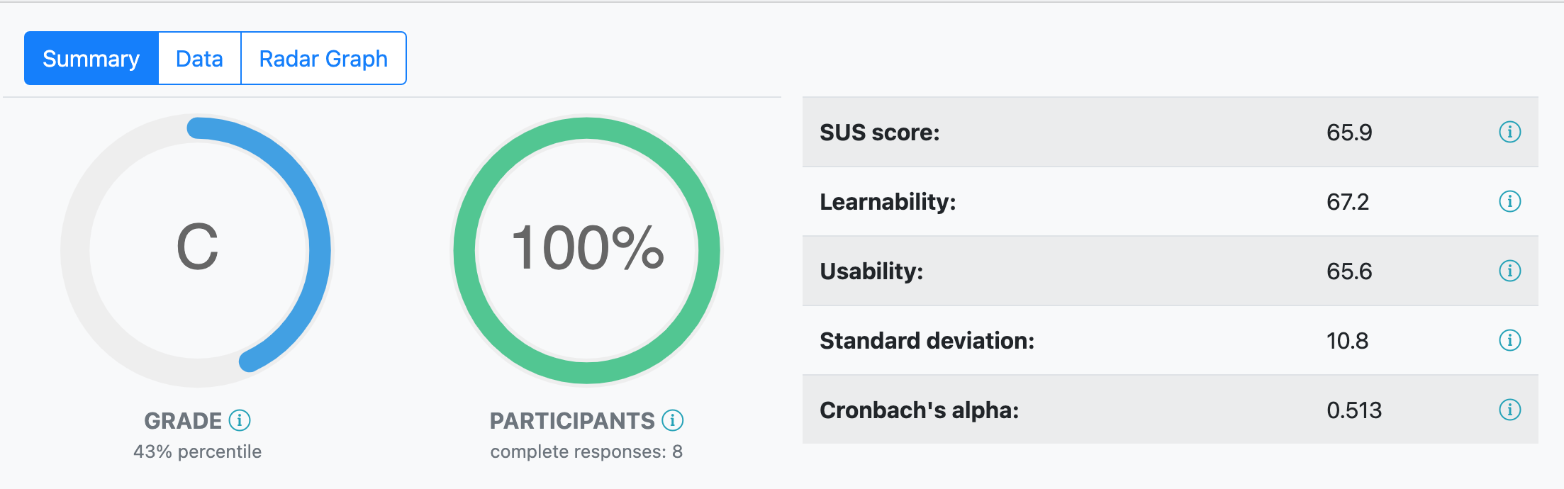
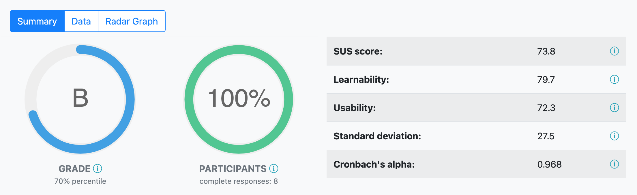
Comparing SUS Results | Customers vs. Customer Service
Both customers and customer service were asked to complete a system usability scale (SUS) survey at the end of each usability interview.
Customers scored the Document Library at a 65.9 (C).
Customer Service scored the Document Library at a 73.8 (B).
Recommendations for Improving Usability & Usage of the new Document Library
Consider the value prop of adding some of the documents that are not currently available to the library. This would include analyzing how often and how many customers request documents like COA, COC, COI, Prop 65 Warning, and PFAs documents.
Provide a way to see the total (#) of documents available per language. This should be possible from the back end and give EMEA customers a feel for how many documents are available in the language that they need. Also, consider future state allowing customers to see horizontally all available languages for a specific document vs. repeating the document over and over.
Add a tooltip to the product family filter to provide clarity on what this is for external users.
Provide clarification on what we mean by plant location to our customers by updating the header on the filter and table to something like “[Company] Mfg. Plant”. Another consideration would be to remove plant location from the external experience based off the findings above.
Consider surfacing the expiration date for documents at a table content level vs. having to preview each one first. Improve overall transparency between differing dates on documents.
Maximize the search functionality; ensuring that users can search by keywords with expected results.
The following validated recommendations were already in progress with the UX team based off the first few rounds of user research!
It’s encouraging that these active updates were validated by both customers and customer service feedback.
Create an experience that's driven by the user’s region.
Ensure that the filter pills are displaying as intended by the UX team.
Create a global horizontal search component with helper text rather than a tiny left aligned search input.
Rather than showing General & Product Specific Documents as the document types users can bounce between, allow users to see a breakdown of available document types in the library with the ability to select all for both general and product specific documents.
Regarding the current download limit UX experience, users will no longer see the 0/50 UI which should provide clarity.
Pagination will be included to allow users the ability to see a max of 50 per page which also eliminates the need for any type of error alert related to a user trying to download 51 or more documents at once.